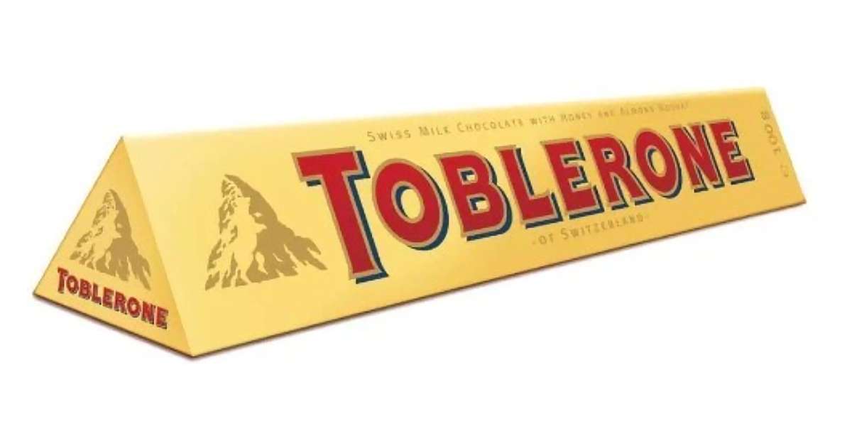
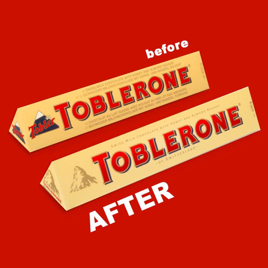
Do you see a bear hidden in Toblerone’s design? If not – read the full description of this project. Toblerone is the most unique brand in the confectionery market produced only in Switzerland. Toblerone is an occasional product purchased most often as a gift. That’s why the brand needed to improve its aesthetic appearance in stores.
The new brand icon and lettering have a more prestigious and elegant look.
Thanks to this design refinement the product’s visibility on shelf was increased. The golden peak of the Matterhorn became a unique design element, giving the package a more illuminating and refreshing look. Thanks to the visual icon embossed onto the packaging we achieved a more vivid and three-dimensional visual message. The brand icon actually hides a figure of a bear standing on hind legs. The bear is the symbol of Bern, Toblerone’s place of origin.
NOTE: our portfolio in the confectionery category consist of 75+ cases studies from 2 dozens of markets. Contact us directly if you need to review more!